您现在的位置是:网站首页> 编程资料编程资料
css实现“加号”效果的实例代码纯CSS制作各种各样的网页图标(三角形、暂停按钮、下载箭头、加号等)CSS3 linear-gradient线性渐变生成加号和减号的方法
 2021-09-04
1034人已围观
2021-09-04
1034人已围观
简介 这篇文章主要介绍了css实现“加号”效果的实例代码,代码简单易懂,非常不错,具有一定的参考借鉴价值,需要的朋友可以参考下
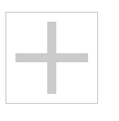
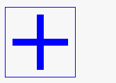
实现下图的加号效果:
若想实现这个效果, 只需一个div元素即可搞定。
需要用到css的为了before和after, 以及border特性。
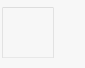
先设置一个div便签
再设置一个边框:
.add { border: 1px solid; width: 100px; height: 100px; color: #ccc; transition: color .25s; position: relative; }此时边框是这样的:
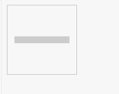
我们可以利用伪类before和其border-top来设置一个“横”:
.add::before{ content: ''; position: absolute; left: 50%; top: 50%; width: 80px; margin-left: -40px; margin-top: -5px; border-top: 10px solid; }注意我们使了绝对定位。 此时变成了这样:
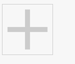
参照上面, 我们可以使用after伪类和border-bottom设置一个“竖”:
.add::after { content: ''; position: absolute; left: 50%; top: 50%; height: 80px; margin-left: -5px; margin-top: -40px; border-left: 10px solid; }在加上hover伪类,设置鼠标悬浮上去的颜色:
.add:hover { color: blue; }最终的样式:
当鼠标悬浮上去是, 会变色:
大家可以在这里查看效果:
https://jsbin.com/quvidap/edit?html,css,output
总结
以上所述是小编给大家介绍的css实现“加号”效果的实例代码,希望对大家有所帮助,如果大家有任何疑问请给我留言,小编会及时回复大家的。在此也非常感谢大家对网站的支持!
相关内容
- css flex几种多列布局详解CSS中的flex布局CSS中display flex整理(布局利器) CSS3 Flex 弹性布局实例代码详解详解CSS3伸缩布局盒模型Flex布局css flex 弹性布局详解CSS3新增布局之: flex详解
- 值得收藏的CSS命名规范(规则)常用的CSS命名规则
- CSS实现元素居中原理解析css 不定宽高的元素居中布局解决方案浅谈css元素居中CSS元素居中布局的简单方法CSS实现定位元素居中的方法html元素水平居中、垂直居中、水平垂直居中于其父级元素的方法css控制div中元素居中的示例css实现元素居中的N种方法
- 了解CSS3的all属性的使用CSS Transition通过改变Height实现展开收起元素从QQtabBar看css命名规范BEM的详细介绍css实现两栏布局,左侧固定宽,右侧自适应的多种方法CSS 实现Chrome标签栏的技巧CSS实现两列布局的N种方法CSS实现隐藏搜索框功能(动画正反向序列)CSS3中Animation实现简单的手指点击动画的示例详解CSS中的特指度和层叠问题详解overflow:hidden的作用(溢出隐藏、清除浮动、解决外边距塌陷)关于CSS浮动与取消浮动的问题
- css 两边固定中间自适应布局的实现CSS三栏布局探讨——中间固定宽度两边自适应宽度
- css实现文字颜色渐变的三种方法纯CSS3实现的背景颜色渐变动画特效源码CSS3 background-image颜色渐变的实现代码CSS3的颜色渐变效果的示例代码在线CSS颜色/透明度渐变效果代码工具通过css3背景控制属性+使用颜色过渡实现渐变效果
- CSS3田字格列表的样式编写方法css3中transform属性实现的4种功能详解CSS3.0(Cascading Style Sheet) 层叠级联样式表纯CSS3实现div按照顺序出入效果CSS3实现列表无限滚动/轮播效果css3 利用transform-origin 实现圆点分布在大圆上布局及旋转特效CSS3实现的侧滑菜单CSS3实现的3D隧道效果用CSS3画一个爱心css3 实现文字闪烁效果的三种方式示例代码六种css3实现的边框过渡效果
- CSS导航条菜单之带小三角形的实现代码CSS 带搜索导航栏的示例代码html+css+js实现导航栏滚动渐变效果css锚点定位被顶部固定导航栏遮住的解决方案不可思议的CSS导航栏下划线跟随效果html+css 实现简易导航栏功能css实现导航切换的实例代码CSS设置列表样式和创建导航菜单实现代码CSS中的导航栏和下拉菜单的实现纯CSS + 媒体查询实现网页导航效果CSS3 二级导航菜单的制作的示例
- css选择器设置标签样式的实例代码浅谈html5标签css3的常用样式CSS list-style修改列表属性控制li标签样式将html标签在浏览器居中显示的css样式CSS list-style属性控制li标签样式示例代码CSS实现鼠标悬停改变其他标签样式的示例代码
- css 获取从第n个开始之后的所有元素 CSS :befor :after 伪元素的巧妙用法详解CSS nth-child与nth-of-type的元素查找方式css判断某元素的子元素个数并分别设置样式的方法CSS 实现元素较宽不能被完全展示时将其隐藏的方法css3实现多个元素依次显示效果单元素利用css实现多重边框效果示例代码css3之UI元素状态伪类选择器实例演示利用CSS3伪元素实现逐渐发光的方格边框